Status
A widget to dipslay status
- props
| Property | Description | Type | Default |
|---|---|---|---|
| type | status type | success | info | warning | error | invalid | - |
| status | the text for displaying status | string | - |
| style | customize style of status | any | - |
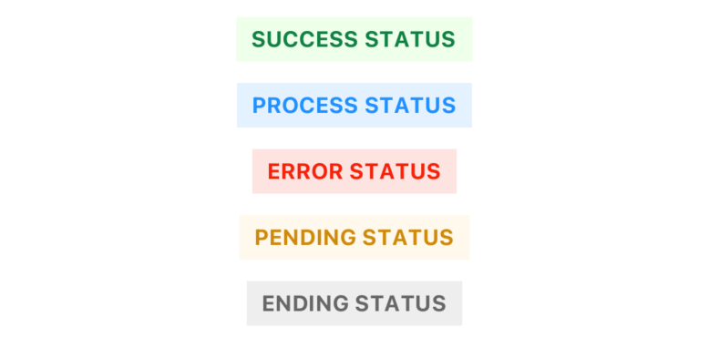
<Status
  type={'success'}
  status={'SUCCESS STATUS'}
  style={{ marginTop: 12, }}
/>
<Status
  type={'info'}
  status={'PROCESS STATUS'}
  style={{ marginTop: 12 }}
/>
<Status
  type={'error'}
  status={'ERROR STATUS'}
  style={{ marginTop: 12 }}
/>
<Status
  type={'warning'}
  status={'PENDING STATUS'}
  style={{ marginTop: 12 }}
/>
<Status
  type={'invalid'}
  status={'ENDING STATUS'}
  style={{ marginTop: 12 }}
/>