Button
Button is the common widget for click action. And we have FWButton and CWButton derived from it.
We usually use FWButton and CWButton instead of Button directly.
- props
| Property | Description | Type | Default |
|---|---|---|---|
| action | only used in Form to tell form it will trigger onFinish | submit | - |
| containerStyle | customize the style of button container | any | - |
| textStyle | customize the style of text in button | any | - |
| text | showing text in button | string | - |
| children | you can customze the inner content instead of providing text | ReactNode | - |
| onClick | when button click, what to do | void | - |
| disabled | whether button is disabled | boolean | - |
| capitalize | whether show uppercases of text | boolean | - |
<Button
  text={'Base Button'}
  containerStyle={{ width: 300, height: 50, borderwidth: 1, borederColor: '#ccc', backgroundColor: '#f00', borderRadius: 20 }}
  textStyle={{ color: '#fff' }}
  onClick={() => {SimpleToast.show('Submit')}}
/>

FWButton
Full Width Button
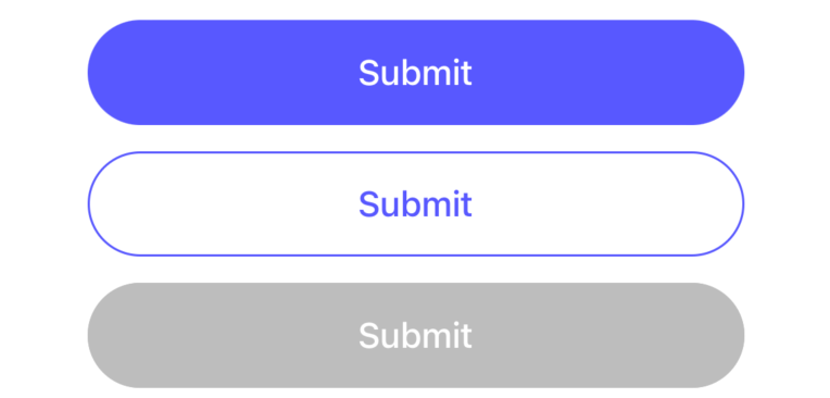
<Button.FWButton
  style={{ width: 300, marginTop: 12  }}
  text={'Submit'}
  onClick={() => {SimpleToast.show('Submit')}}
/>
<Button.FWButton
  style={{ width: 300, marginTop: 12  }}
  text={'Submit'}
  type={'secondary'}
  onClick={() => {SimpleToast.show('Submit')}}
/>
<Button.FWButton
  style={{ width: 300, marginTop: 12  }}
  text={'Submit'}
  disabled
  onClick={() => {SimpleToast.show('Submit')}}
/>
CWButton
Custom Width Button
<Button.CWButton
  style={{ marginHorizontal: 32, marginTop: 12 }}
  text={'Submit'}
  onClick={() => {SimpleToast.show('Submit')}}
/>
<Button.CWButton
  style={{ marginHorizontal: 32, marginTop: 12 }}
  text={'Submit'}
  type={'secondary'}
  onClick={() => {SimpleToast.show('Submit')}}
/>
<Button.CWButton
  style={{ marginHorizontal: 32, marginTop: 12 }}
  text={'Submit'}
  disabled
  onClick={() => {SimpleToast.show('Submit')}}
/>