Alert
A widget to show alert
- props
| Property | Description | Type | Default |
|---|---|---|---|
| style | customize style of alert container | any | - |
| textStyle | cusomize style for alert text | any | - |
| type | alert type | success | info | warning | error | invalid | - |
| text | alert text | string | - |
| children | alert content | ReactNode | - |
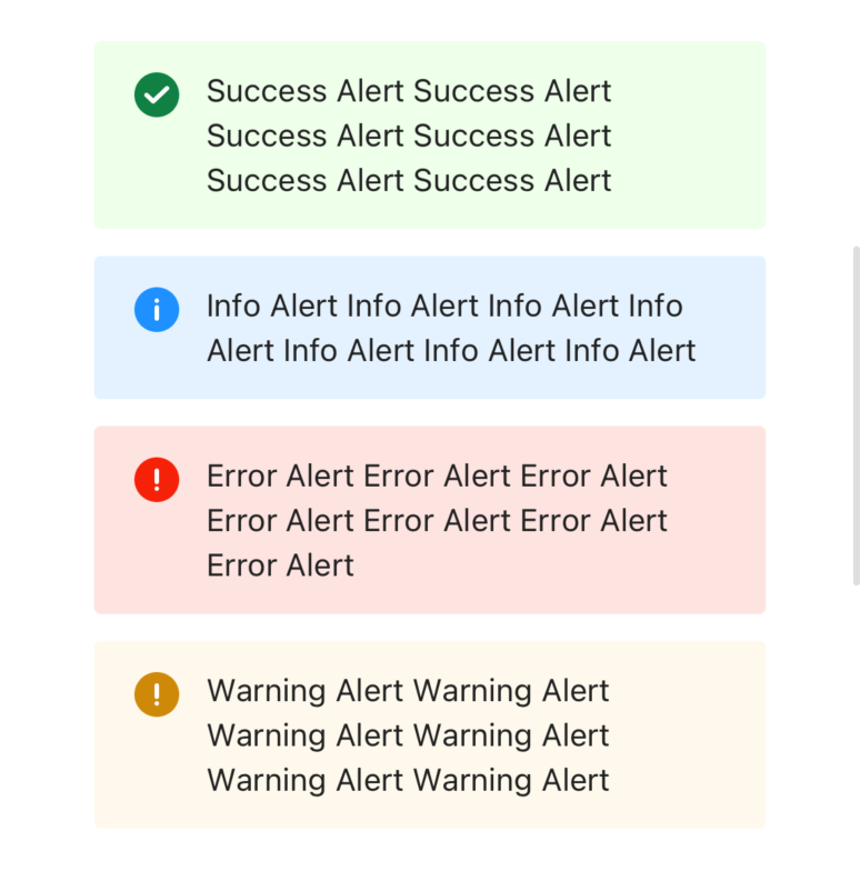
<Alert
  style={{ width: 300, marginTop: 12 }}
  type={'success'}
  text={'Success Alert Success Alert Success Alert Success Alert Success Alert Success Alert '}
/>
<Alert
  style={{ width: 300 , marginTop: 12}}
  type={'info'}
  text={'Info Alert Info Alert Info Alert Info Alert Info Alert Info Alert Info Alert '}
/>
<Alert
  style={{ width: 300, marginTop: 12 }}
  type={'error'}
  text={'Error Alert Error Alert Error Alert Error Alert Error Alert Error Alert Error Alert '}
/>
<Alert
  style={{ width: 300, marginTop: 12}}
  type={'warning'}
  text={'Warning Alert Warning Alert Warning Alert Warning Alert Warning Alert Warning Alert '}
/>