Card
A widget to show general info with card style, the child is Card.Item
- props
| Property | Description | Type | Default |
|---|---|---|---|
| style | style of Card continer | any | - |
| title | title | string | - |
| titleStyle | style of title | any | - |
| children | content of Card | Card.Item | - |
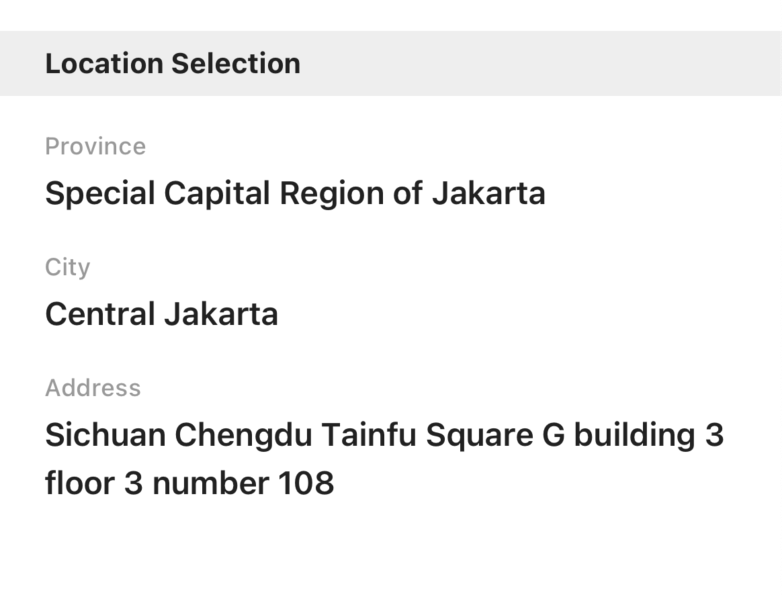
<Card
  title={'Location Selection'}
>
  <Card.Item label={'Province'} value={'Special Capital Region of Jakarta'}/>
  <Card.Item label={'City'} value={'Central Jakarta'}/>
  <Card.Item label={'Address'} value={'Sichuan Chengdu Tainfu Square G building 3 floor 3 number 108'}/>
  <Card.Item label={'Photo'} value={
    <Preview
      files={previewFiles}
    />
  }/>
</Card>
Card.Item
| Property | Description | Type | Default |
|---|---|---|---|
| style | style of Card continer | any | - |
| label | label | string | - |
| labelStyle | style of label | any | - |
| value | value | string | - |
| valueStyle | style of value | any | - |