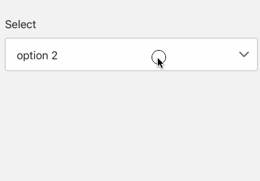
Select
A widget for user to select options, often used for province/city selection
- props
| Property | Description | Type | Default |
|---|---|---|---|
| style | style for containe of Select | any | - |
| status | show different status of Select | success | error | warning | - |
| value | value of Select | string | - |
| onChange | callback when option change | function | - |
| options | options for Select | {label: string, value: string}[] | - |
| textStyle | style of option text | any | - |
| disabled | whether disable the widget | boolean | fasle |
<Select
  options={[
    {
      label: 'option 1',
      value: 'option 1',
    },
    {
      label: 'option 2',
      value: 'option 2',
    }
  ]}
/>