Checkbox
A widget for user to opt in
- props
| Property | Description | Type | Default |
|---|---|---|---|
| style | style for containe of Checkbox | any | - |
| status | show different status of TextArea | success | error | warning | - |
| value | value of Checkbox | string | - |
| onChange | callback when check condition change | function | - |
| content | content of Checkbox | string | \ ReactNode |
| textStyle | style of content | any | - |
| checkedColor | color for checked frame | color string | - |
| uncheckedColor | color for unchcked frame | color string | - |
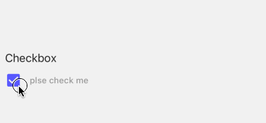
<Checkbox content='plse check me' />